TWizard
API Manual
Overview
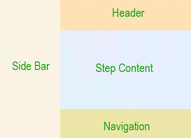
TWizard is analogous to the installation wizard commonly used to install software on Windows. It splits a large form and presents the user with a series of smaller forms, called wizard steps, to complete. The following figure shows how a wizard is composed of when presented to users, where step content is the main content of a wizard step for users to complete, header refers to header content common to all steps, navigation contains buttons that allow users to navigate step by step, and side bar contains a list of hyperlinks by which users can reach to any step with one click. The visibility of the side bar can be toggled by setting ShowSideBar.
By default, TWizard embeds the above components in an HTML table so that the side bar is displayed on the left while the rest on the right. If UseDefaultLayout is set to false, no HTML table will be used, and developers should use pure CSS techniques to position the wizard components. Note, each component is displayed as a <div> and the wizard itself is also a <div> that encloses its components' <div>.
Wizard steps are represented by TWizardStep and are maintained in TWizard through its WizardSteps property. At any time, only one step is visible, which is determined by the ActiveStep property. The ActiveStepIndex property gives the index of the active step in the step collection. Clicking on navigation buttons can activate different wizard steps.
Wizard steps are typically added to a wizard through template as follows,
<com:TWizard>
	<com:TWizardStep Title="step 1" StepType="Start">
	content in step 1, may contain other controls
	</com:TWizardStep>

	<com:TWizardStep Title="step 2" StepType="Step">
	content in step 2, may contain other controls
	</com:TWizardStep>

	<com:TWizardStep Title="finish step" StepType="Finish">
	content in finish step, may contain other controls
	</com:TWizardStep>
</com:TWizard>
In the above, StepType refers to the type of a wizard step, which can affect how the navigation appearance and behavior of the step. A wizard step can be of one of the following types:
- Start - the first step in the wizard.
- Step - the internal steps in the wizard.
- Finish - the last step that allows user interaction.
- Complete - the step that shows a summary to user. In this step, both side bar and navigation panel are invisible. Thus, this step usually does not allow user interaction.
- Auto - the step type is determined by wizard automatically.
Using TWizard
A Single-Step Wizard Sample
In this sample, we use wizard to collect user's preference of color. In the first step, the user is presented with a dropdown list from which he can choose his favorite color. In the second step, the complete step, his choice in the previous step is displayed. In real application, at this step the choice may be stored in database in the backend.
Customizing Wizard Styles
TWizard defines a whole set of properties for customization of appearance of its various components as shown in the above figure. In particular, the following properties are provided for style customization:
- Header - HeaderStyle.
- Step - StepStyle.
- Navigation - NavigationStyle, StartNextButtonStyle, StepNextButtonStyle, StepPreviousButtonStyle, FinishPreviousButtonStyle, FinishCompleteButtonStyle, CancelButtonStyle.
- Side bar - SideBarStyle, SideBarButtonStyle.
Customizing Wizard Navigation
Given a set of wizard steps, TWizard supports three different ways of navigation among them:
- Bidirectional - Users can navigate forward and backward along a sequence of wizard steps. User input data is usually collected at the last step. This is also known as commit-at-the-end model. It is the default navigation way that TWizard supports.
- Unidirectional - Users can navigate forward along a sequence of wizard steps. Backward move is not allowed. User input data is usually collected step by step. This is also known as command-as-you-go model. To disallow backward move to a specific step, set its AllowReturn property to false.
- Nonlinear - User input in a step determines which step to go next. To do so, set ActiveStepIndex to the step that you want the user to go to. In this case, when a user clicks on the previous button in the navigation panel, the previous step that they visited (not the previous step in the sequential order) will become visible.
Using Templates in Wizard
TWizard supports more concrete control of its outlook through templates. In particular, it provides the following template properties that allow complete customization of the wizard's header, navigation and side bar.
- Header - HeaderTemplate.
- Navigation - StartNavigationTemplate, StepNavigationTemplate, FinishNavigationTemplate.
- Side bar - SideBarTemplate.
Using Templated Wizard Steps
Wizard steps can also be templated. By using TTemplatedWizardStep, one can customize step content and navigation through its ContentTemplate and NavigationTemplate properties, respectively. This is useful for control developers to build specialized wizards, such as user registration, shopping carts, etc.